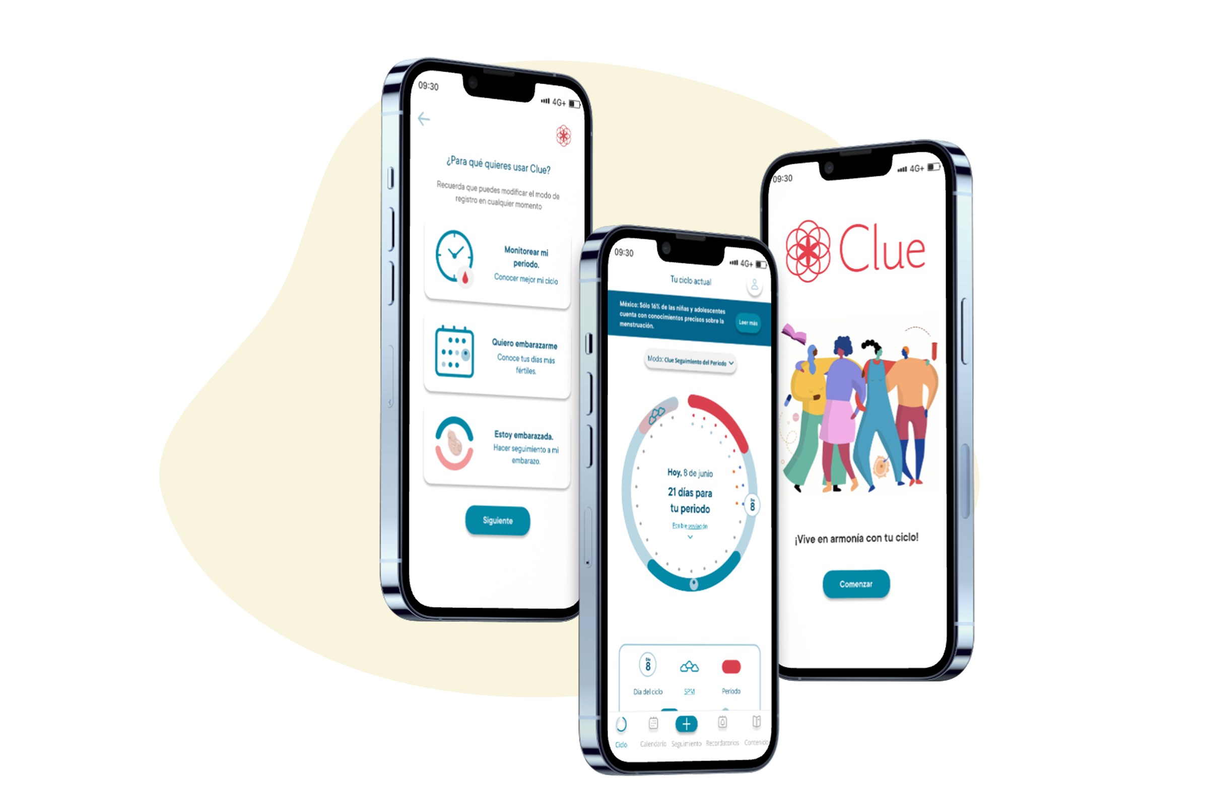
Why Clue?
We explored the UX case of Clue, the globally acclaimed menstrual cycle tracking app. As the most downloaded and highest-rated app in its category, Clue is a benchmark in user-centered design, transforming the way women manage their reproductive health.
This study stems from our decision to improve Clue's UI in its Spanish version, in line with our mission to advocate for women's health. The analysis not only highlights technical improvements but also emphasizes the app's role in providing accessible, friendly tools that allow women to monitor key aspects of their well-being.
The Challenge
Identify potential improvements in the Clue app through testing, focusing on 3 specific areas: Registration-Onboarding, Start screen, and Tracking.
Develop improvement proposals that deliver a clearer and more satisfying user experience.
Create interactive prototypes evaluated through testing with real users.
How did we come to know our users?

clue-challenge.png
480 × 480px
Findings
Registration was rated as easy by new users.
They think that the steps to register are sufficient and they have the necessary information to get connected.
They find the design simple and effective.
"Me parece un diseño muy sobrio casi sin identidad"
"The design feels very plain, almost without identity"
CLAUDIA, 36
Users appreciate the app's inclusive and neutral language, finding it reliable.
Suggestions include adding cycle alerts for enhanced functionality.
Users prefer consolidating all cycle information onto a single screen for convenience.
Some users find the distinction between the calendar and analytics features unclear.
"Siento que tengo la información pero no la forma de recordarla"
"I feel I have the information but not the way to remember it"
CANDY, 24
Users find the tracking confusing as some icons and colors are very similar.
Some buttons interfere with the tracking save flow.
"Me es confuso el uso variado de colores y cómo puedo agregar mis síntomas"
"The varied use of colors and how to add my symptoms is confusing to me"
SARA, 28
Insight
Main Insight
The Clue app is useful, intuitive, and has a simple interface. However, it feels distant because its storytelling and tone prioritize the reproductive aspect of the cycle. This contrasts with the way its users actually use Clue — as a tool for self-awareness and a source of information for their medical appointments.
Design Phase — MoSCoW Prioritization
Following the discovery phase, we prioritize ideas using the MoSCoW tool.
Mo · Must Have
Harmonize fonts, letter sizes, numbers, and icons.
Topicalize and enhance UX writing.
Integrate analysis at the Home screen.
Add reminders to the bottom bar.
Incorporate key icons to enhance the quality of information for users.
Add value to the premium subscription invitation.
S · Should Have
Strategically incorporate the logo and slogan on certain screens.
Modify colors of the 'cycle' graphic on the Home screen.
Adjust calendar color scheme.
Co · Could Have
Integrate an icon into the onboarding for 'What do you want to do?'
W · Won't Have
Implement a discussion forum for the exchange of ideas among users.
Prototyping
"UX for this project — it's not just about simplifying the process; it's about inspiring confidence and control over one's own body."
First Sketches
After finalizing our ideas on paper and starting to create medium-fidelity wireframes, we decided to conduct testing through Maze to gather qualitative data on our proposals using the following KPIs:
⏱Decrease task time
✓Increase task success
↓Decrease error rate
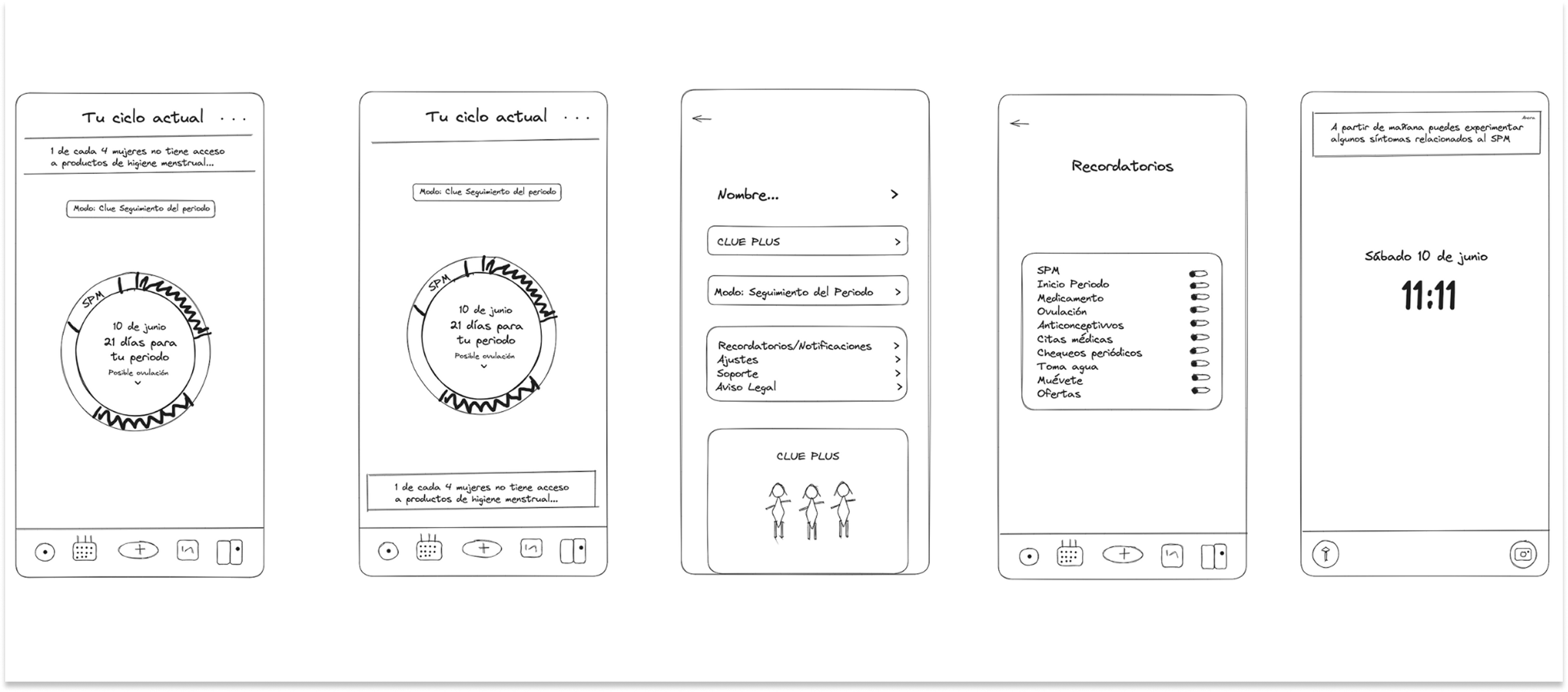
clue-sketches.png
First sketches — low-fidelity wireframes for the 3 main flows
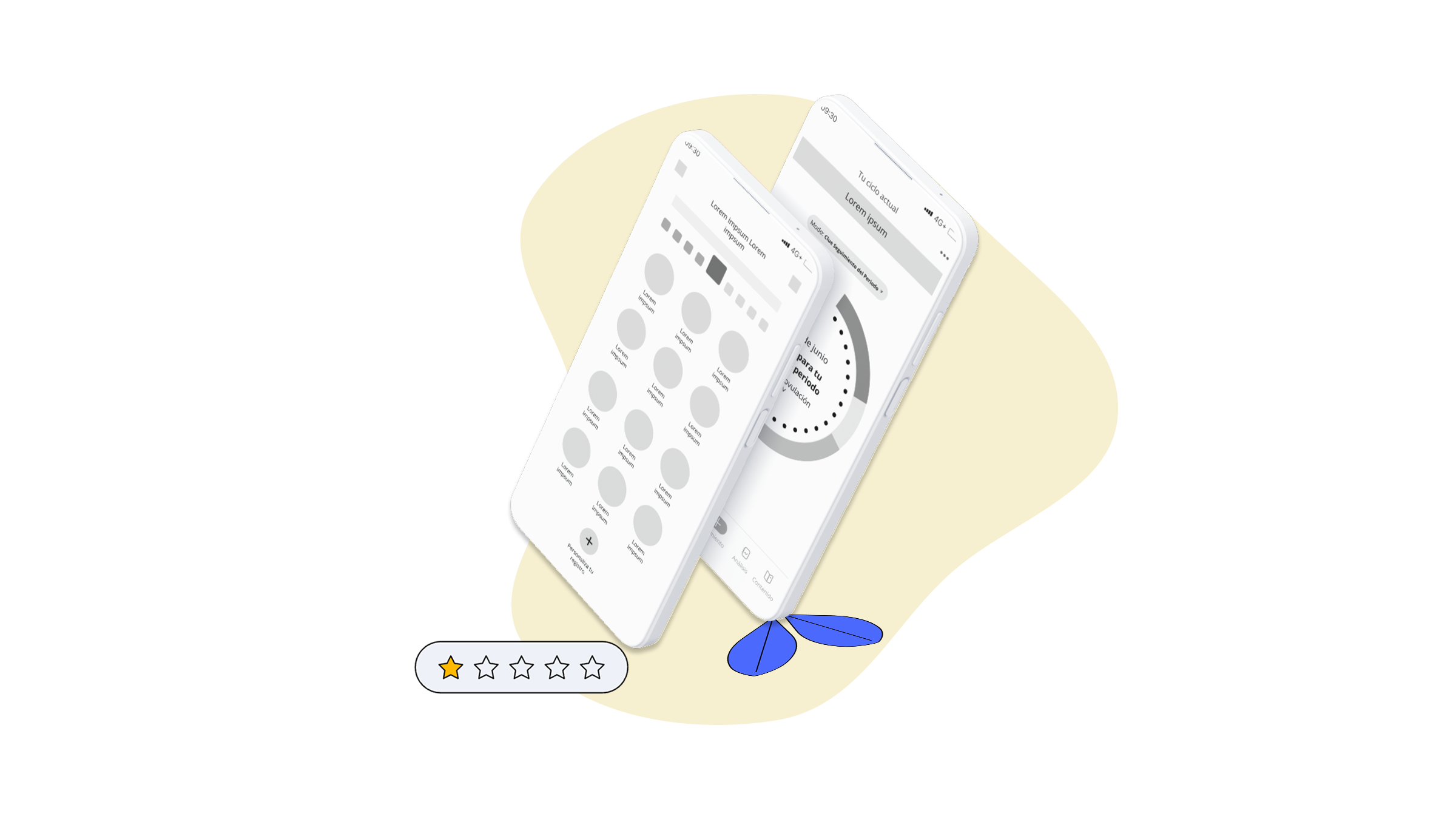
clue-wireframes.png
Mid-Fidelity Wireframes — iterated for testing in Maze
Testing and Iteration
Testing results for 29 users through Maze platform.
Task 1
80% of users completed the task.
5.7 seconds total time to complete the flow.
1.3% average click error rate.
Task 2
60% of users completed the task.
25 seconds in total to complete the flow.
50.1% average click error rate.
Task 3
70% of users DID NOT complete the task.
91 seconds in total to complete the flow.
57% average click error rate.
60% abandonment rate.
Usability Score
80
0
100
100
100
100
0
Results — Final Prototype
Onboarding
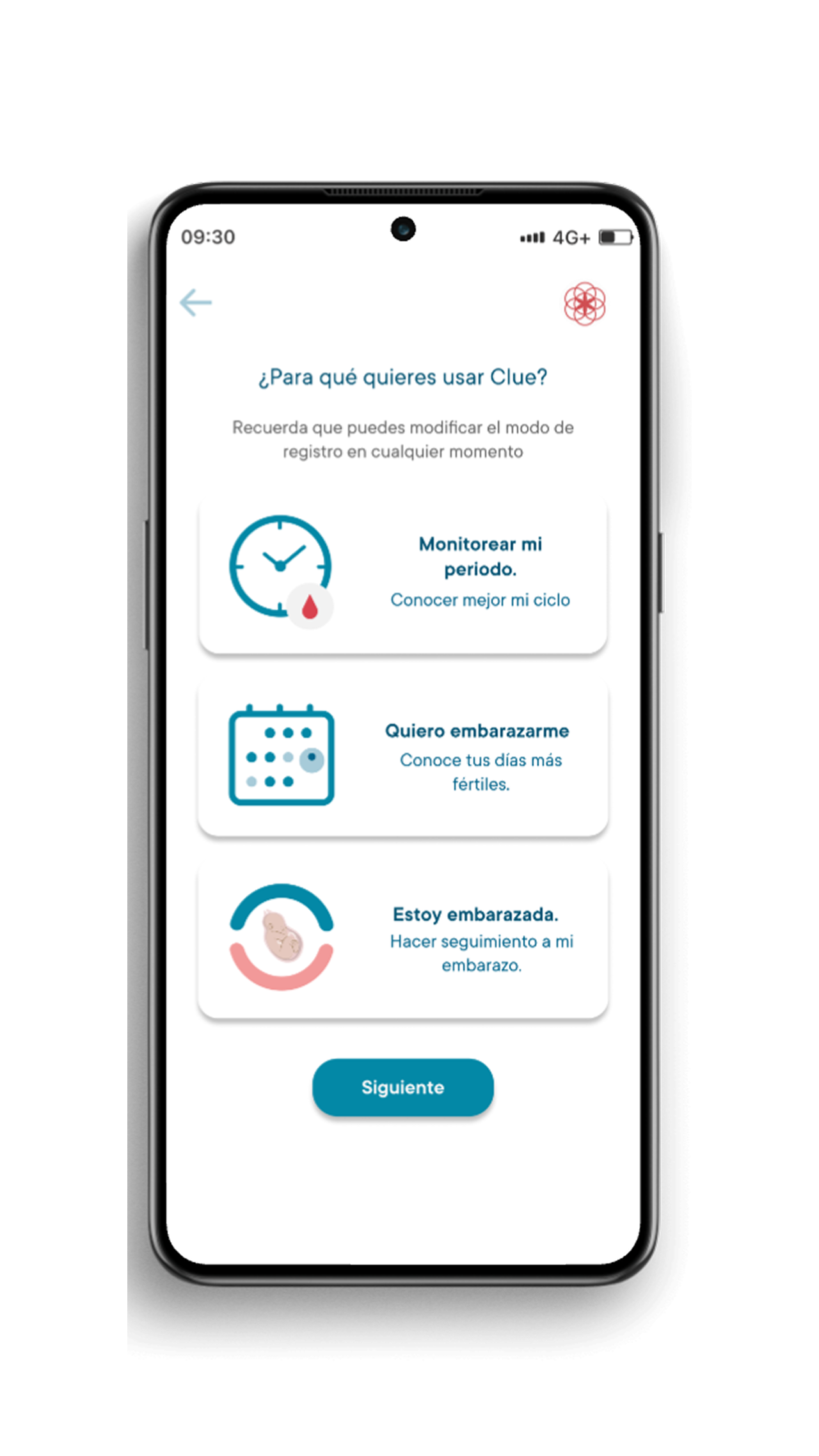
clue-result-onboarding.png
We've enhanced the readability of the home cards through a simplified design.
We have revised the onboarding copy to enhance its clarity.
Optimized button size to mitigate visual competition with on-screen information.
Start Screen
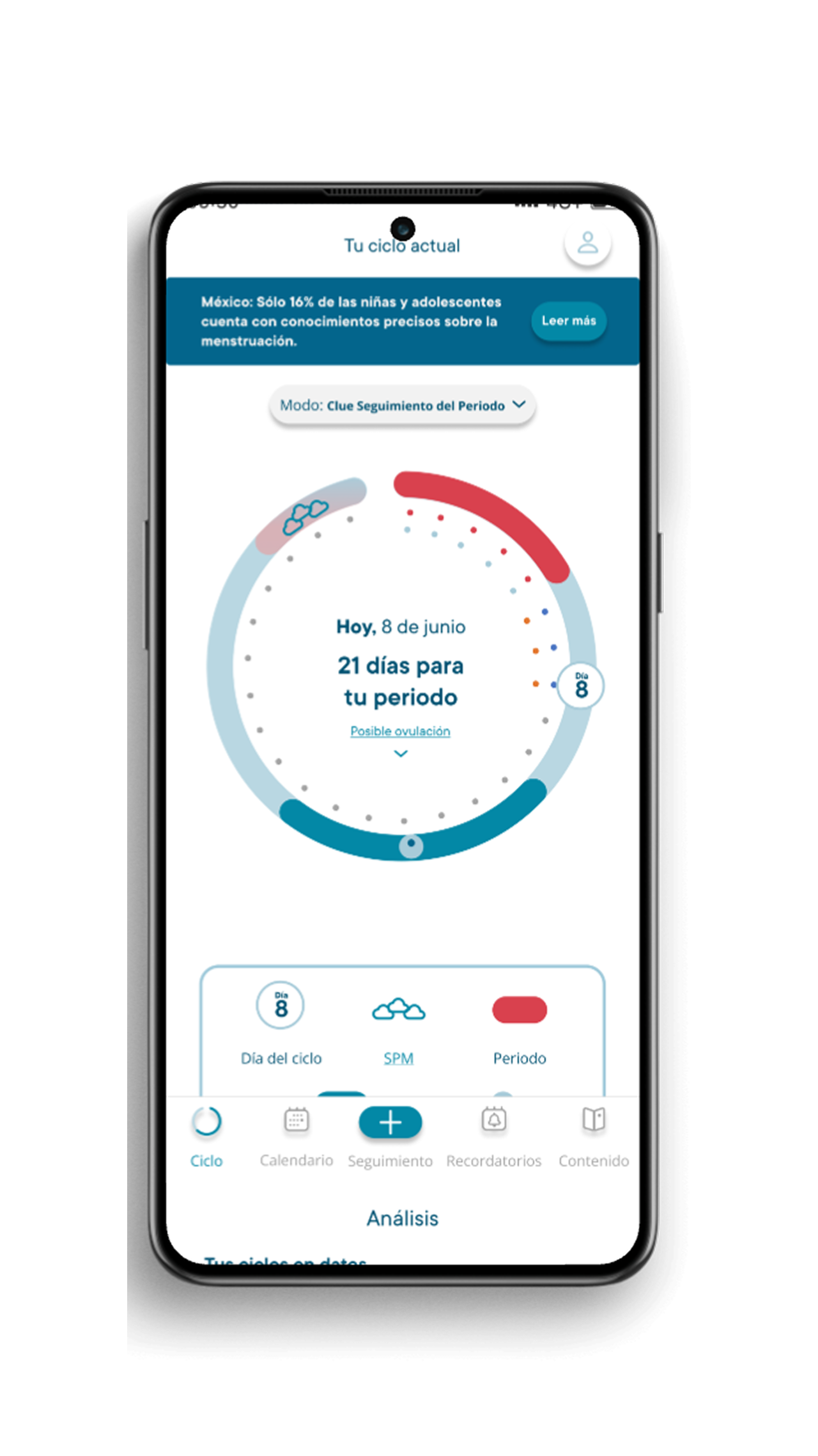
clue-result-startscreen.png
Invitation to Plus with relevant information integrated in context.
Create an intuitive icon to access the user account.
Option to manually switch the application mode from the home screen.
One screen with all the key info about the period.
Redesign of the cycle icon + Alerts in the main bar.
Tracking Screen
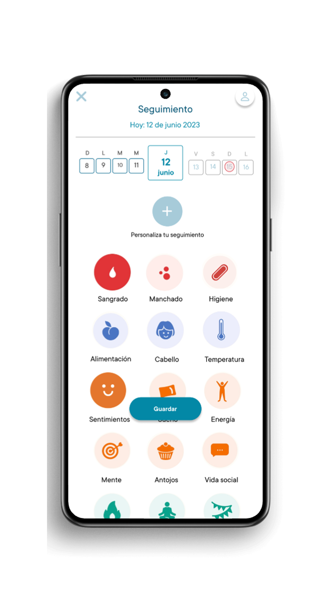
clue-result-tracking.png
We separated the customize symptoms button to visually highlight it.
Using different font weights is helpful to distinguish and highlight important dates for the user.
We improved the readability of the icons and added proper categorization by color to them.
Improved button size to avoid competition with screen info.
UI Kit
Typography: Commons
T1-ABCDEFGHIJK1234
T2-ABCDEFGHIJK1234
T3-ABCDEFGHIJK1234
Header-ABCDEFGHIJK1234
Body-ABCDEFGHIJK1234
Call out: ABCDEFGHIJK1234
Sub-headline- ABCDEFGHIJK1234
Illustrations & UI Kit
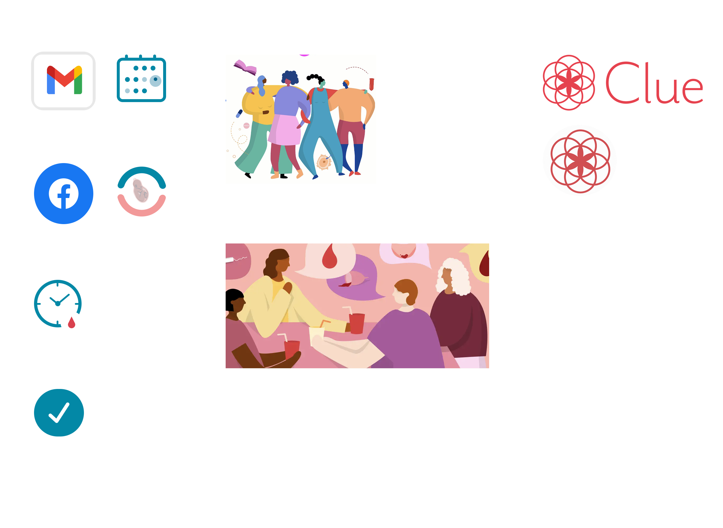
clue-uikit.png
Interactive Elements
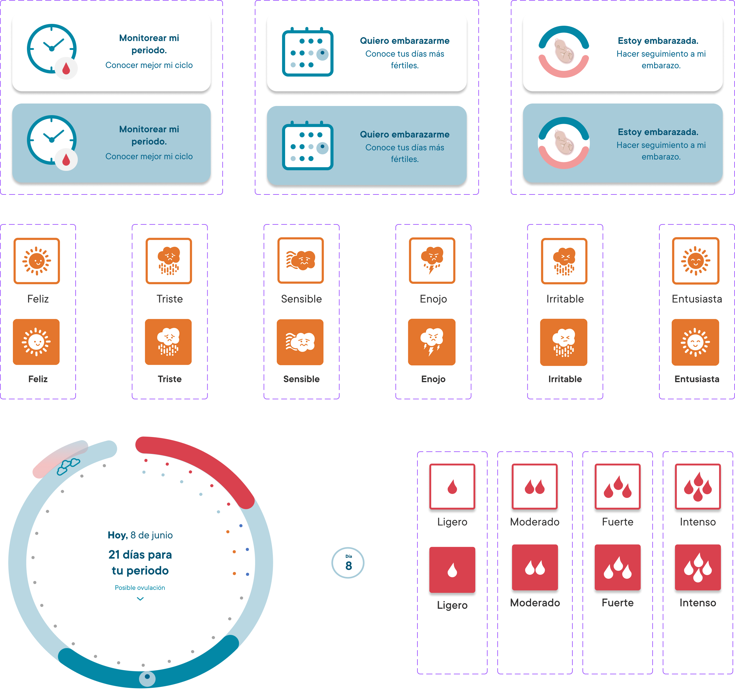
clue-interactive.png
1200px de ancho, altura libre
Scroll to see all interactive elements
"Design iteration brings powerful results"
— Interactive Design Foundation